
First Look at the QUnit 3 Theme
A deep dive into the accessibility and usability improvements to the default theme in QUnit 3.
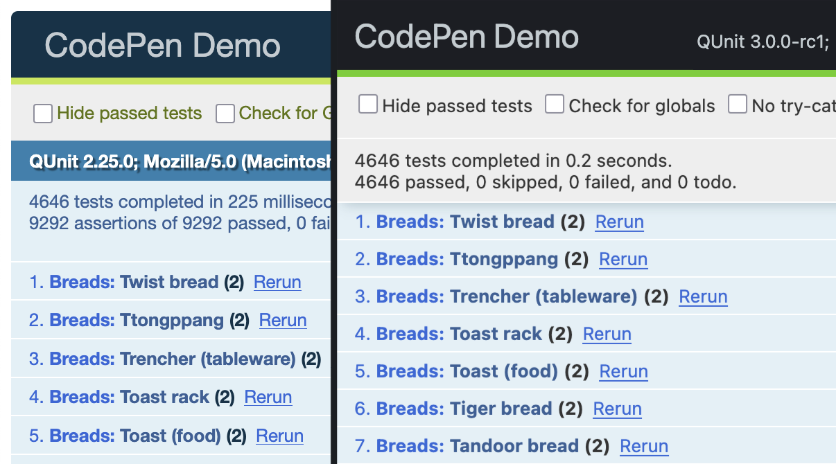
Accessibility & Legibility
The updated theme favors deeper and more vibrant colors, with higher contrast against respective backgrounds. We’ve also removed any text shadows and adopted the system-ui font. This makes text clearer and easier to read.
This new color palette is based on qunit-theme-ember by Ignace Maes (available via theme: 'ember' in ember-qunit v8.1) which in turn is based on the Ember styleguide. It also builds on previous color contrast fixes in QUnit 2.16.
The simpler palette utilizes fewer colors overall, and the remaining colors carry a consistent meaning.
For example, the toolbar no longer re-uses green for checkbox labels, and blue backgrounds are now reserved for passing tests. Previously, the summary block shared the same shade of blue. This made sense in QUnit 1 where the page itself essentially had a blue background, and the summary was part of the page flow. See also the introduction of a fixed header in QUnit 2.14.
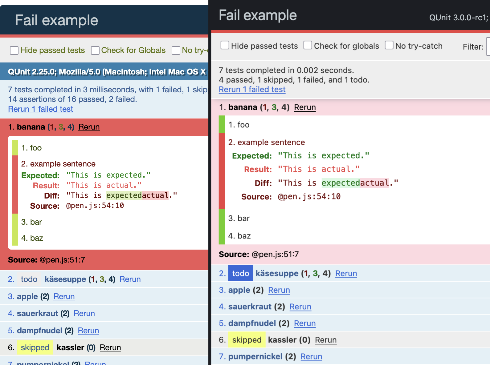
Focus
The old rounded corners and blank space around the page make way for a tighter edge-to-edge design, leaving more space for test results and assertion details—the stuff that matters.
Assertion indicators are now flush with the edge against a lighter background, making them stand out more. The change does not sacrifice any whitespace or line height around text.
The user agent string moves to the title bar, in a muted font. This new placement remains prominent, but no longer demands your attention, and frees some vertical space.
The summary now reports total duration in seconds, instead of milliseconds (170acc0). This is a more human-scale number, especially for large projects. For those of you proud to have test suites that complete in under a second, we still preserve one digit of precision. Small numbers are happy numbers!
QUnit 2.x:
257 tests completed in 512 milliseconds, with 0 failed, 7 skipped, and 4 todo.
825 assertions of 829 passed, 4 failed.
QUnit 3.0:
257 tests completed in 0.5 seconds.
246 passed, 0 failed, 7 skipped, and 4 todo.
The summary no longer reports on low-level assertion counts. The assertion counts were distracting and inactionable in practice. For example, a passing “todo” test expects failing assertions and these counted towards the internal “failed” assertion count despite not failing the test (dbeab48, 8f25f26).
Color blindness
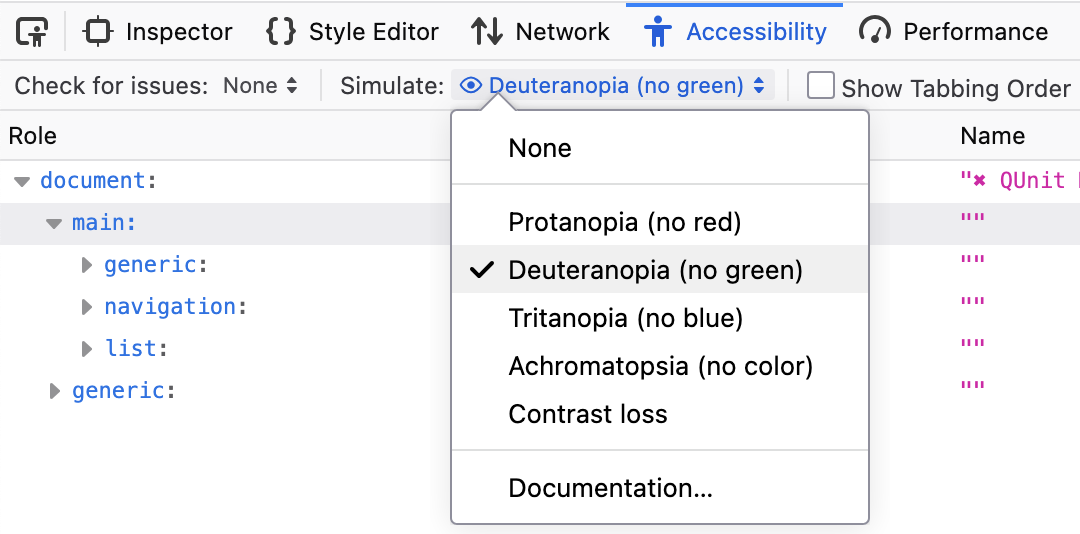
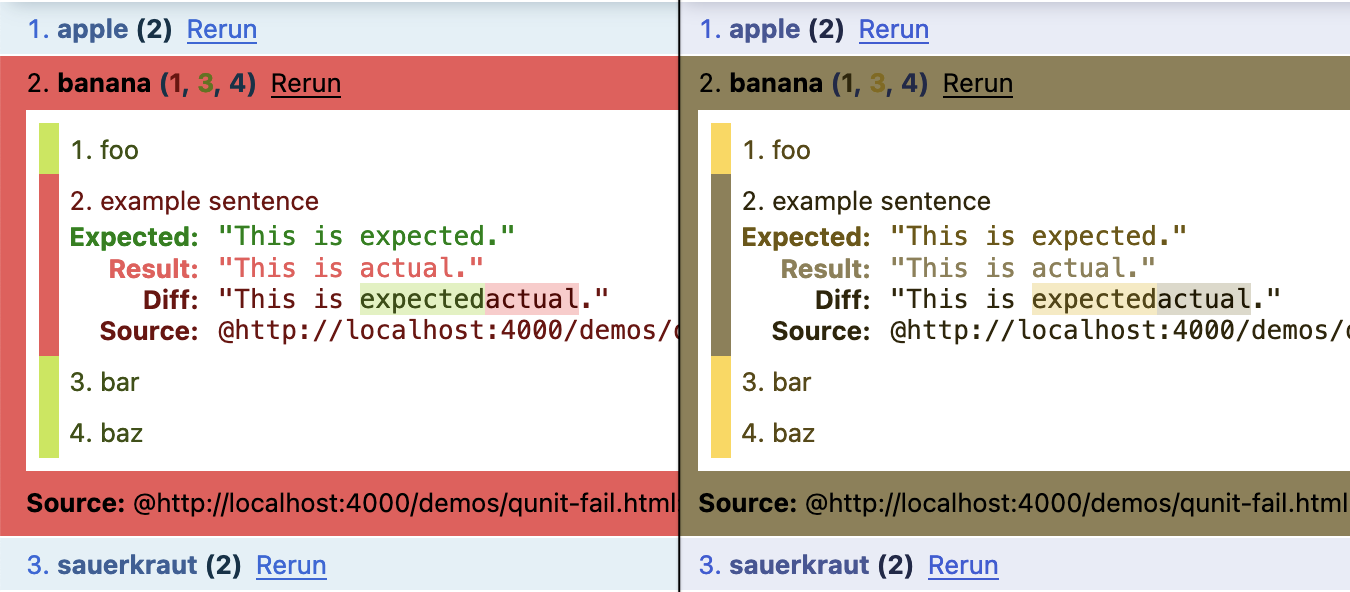
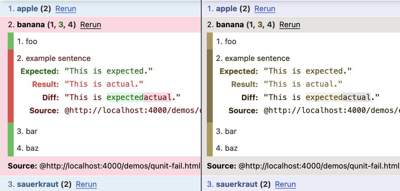
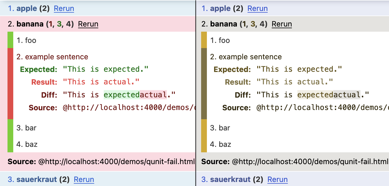
We refined the Ember theme slightly to comply with WCAG guidelines, and to increase contrast under color blind conditions. Especially for deuteranopia, where greens and reds are hard to distinguish, we tweaked our greens to be brighter and closer to yellow. Details in Pull Request #1803.
Shout out to Firefox Dev Tools, which made this a breeze!
Usability fixes
- Fix module selector buttons to use logical order in the DOM, improving tab order for keyboard navigation and screen readers. #1774
- Fix WCAG compliance by changing
#qunit-bannerfrom empty<h2>to<div>. #1427 - Fix HTML serialization by changing
#qunit-testresultwrapper from<p>to<div>. #1301 - Fix text selection to exclude “Rerun” link, reducing noise in text you copy to the clipboard. 6becc19
- Fix “todo” and “skipped” labels to include a space character in the DOM, separating them from the test name. The separation used to be only visual (with CSS margin), causing “todo” and the first word of your test name to be read as one word by screen readers, and in clipboard text. #1774
- Fix unusually wide glyphs in the assertion counts (due to
<b>inside<strong>, multiplying the font-weight “bolder” rule from the user agent stylesheet). #1774 - Exclude page title from fixed header to leave more vertical space for test results. #1774
- Fix layout shift in toolbar at the end of the run. The toolbar now occupies the same height during the “running” and “completed” states. #1774
- Fix unexpected pointer cursor on “Source” label. 52bfa69
- Fix overflow and scrollbar issues, by re-implementing the fixed header with
position: sticky. This creates a regular page-level scrollbar for the test results, and the page now naturally flows under the toolbar. Until now, the test results had their own scrollable area. This fixes various layout quirks with fixtures and other content you may have on the test page, which could previously get squished or pushed outside the viewport. This fixes a regression that started in QUnit 2.14. #1603 - Move “Abort” button to the left. This button previously floated somewhat randomly to the right. #1774
- Animate test execution with a new progress bar. The
#qunit-bannerused to be blank until it turned green or red. #1774